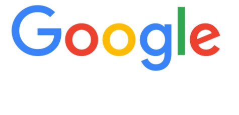
Google and Verizon’s Brand New Logos

September 22, 2015
You’ve surely seen it by now. Google’s new logo. It retains the primary colors and playfully tilted “e” but introduces a new typeface called Product Sans. The update disposes of serifs — those flicks on the ends of letters — and uses fatter strokes reminiscent of kindergarten lesson books. The spaces within the “g” and two “o”s are near-perfect circles. It seems Google is going for a child-friendly look. “We think we’ve taken the best of Google (simple, uncluttered, colorful, friendly) and recast it not just for the Google of today, but for the Google of the future,” brand executives wrote in a launch announcement.
The change took place about a month ago and it’s already viral on the internet. Google, when it came out, was an exhilarating miracle. Search results were fast, accurate, and well-prioritized. Overnight, the Internet went from being a dizzying galaxy of data to a giant, well-cataloged library. The Internet needed a leader to guide it into the future, and Google was it. It was like the Brooklyn Bridge, a welcome triumph of creativity and engineering. So to see it go for a childish look spawned controversy.
But, companies like Verizon followed in suit. If you haven’t noticed, Verizon has a new logo themselves. The trademark red check has been shrunk and moved to the end of their name, which was given a completely black font color, all put on a gray background. It’s shocking to think that such a big change happens to Verizon’s logo and no one notices, while Google changes their font and everyone goes on an uproar about whether or not it’s good or bad. But, it does beg the question: was Google’s change from a sophisticated look to a childish chalk look a good or bad thing? Or does it even matter at all? Nonetheless, it seems Google’s new logo is here to stay.


